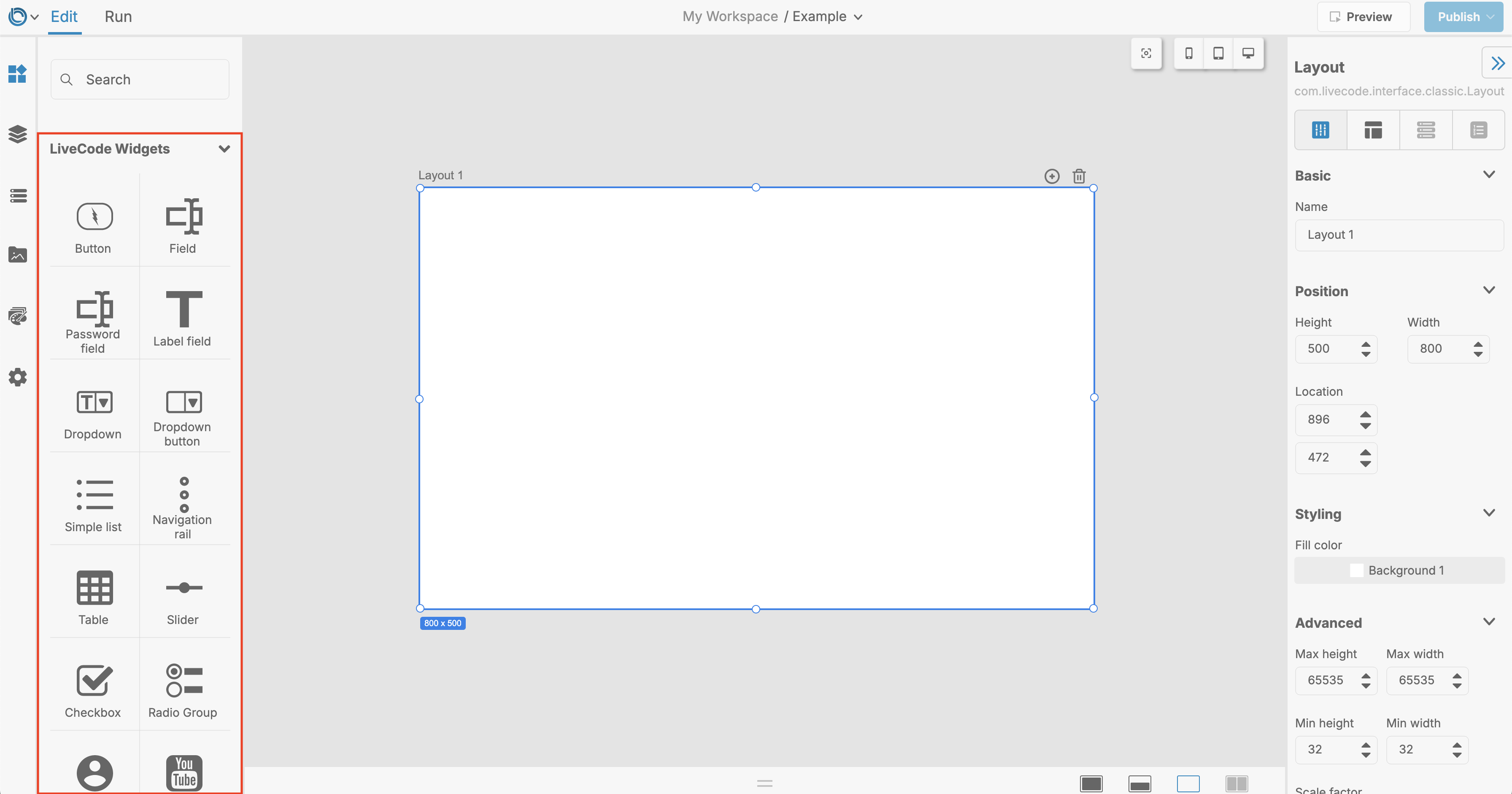
Widget Overview
Widgets are the building blocks of your app's user interface. In LiveCode Create, widgets are prebuilt components that you can drag and drop onto your layout to create interactive and visually appealing screens. From simple buttons to lists and input fields, widgets provide everything you need to build your app quickly and effectively.
This guide provides an overview of widgets in LiveCode Create, introducing their types and how they are used.
What is a Widget?
A Widget is a reusable user interface element that performs a specific function in your app. Widgets can:
- Display content (e.g., text, images, or lists).
- Enable user input (e.g., text fields, checkboxes, or dropdown menus).
- Trigger actions (e.g., buttons or navigation controls).
Widgets allow you to design screens visually without writing code. Each widget can be customized through the Property Inspector to control its appearance, behavior, and data connections.
Accessing Widgets
Widgets are located in the Tools Palette, which is part of the App Building Environment:
- Open your project in LiveCode Create.
- On the left-hand side, open the Tools Palette.
- Browse through the list of available widgets.
- Drag and drop widgets onto the Canvas Area (active layout) to add them to your app.

Types of Widgets
LiveCode Create provides a variety of widgets to meet common design and functional needs. Here’s an overview of the main widget types:
1. Basic Widgets
Basic widgets are the core components for building app interfaces:
- Button: Triggers an action when clicked (e.g., navigate to another layout, submit a form).
- Label: Displays text or static information.
- Image: Displays images from the Media Assets Library.
Example: Add a button to navigate to another screen.
2. Input Widgets
Input widgets allow users to interact with your app and provide information:
- Text Field: Allows users to input text.
- Checkbox: Provides a simple yes/no selection.
- Dropdown Menu: Allows users to select one option from a list.
- Radio Buttons: Presents multiple options, with only one selectable at a time.
Example: Use a Text Field for users to enter their email address.
3. Data Display Widgets
These widgets are used to display dynamic or static data:
- Simple List: Displays a list of items (e.g., tasks or contacts).
- Table: Organizes and displays data in rows and columns.
- Card: Displays structured information, such as titles, descriptions, and images.
Example: Use a Simple List Widget to display tasks stored in your datastore.
4. Navigation Widgets
Navigation widgets help users move between screens or layouts:
- Navigation Rail: Displays navigation links in a vertical or horizontal rail.
- Tab Bar: Allows users to switch between views using tabs.
- Menu: Provides a dropdown or side menu for navigation.
Example: Add a Navigation Rail to allow users to switch between the Home, Settings, and Profile screens.
5. Interactive Widgets
These widgets allow for more dynamic user interactions:
- Slider: Lets users select a value from a range.
- Switch: Provides a toggle between two states (e.g., on/off).
- Progress Bar: Displays progress for a task.
Example: Use a Switch Widget to toggle app settings.
6. Media Widgets
Media widgets display multimedia content in your app:
- Video Widget: Displays video files.
- Audio Widget: Embeds and plays audio content.
Example: Use a Video Widget to show a tutorial video.
Connecting Widgets to Data
Widgets like lists, tables, and fields can display dynamic data from your Datastore.
Steps:
- Add a widget that supports data (e.g., Simple List, Table).
- In the Property Inspector, open the Data Tab.
- Bind the widget to a Collection or Data View from your datastore.
- Map the fields in your data to the properties of the widget.
Example: Display a list of tasks from a collection using the Simple List Widget.
Learn more: Data Binding
Managing Widgets
The Project Browser is a great way to manage all the widgets in your layout:
- Select a Widget: Click on a widget in the Project Browser to locate it on the Canvas Area.
- Rename Widgets: Right-click a widget in the Project Browser to rename it for clarity.
- Group Widgets: Select multiple widgets and group them into a container for better organization.
Tips for Using Widgets
- Start with the Basics: Use simple widgets like buttons and text fields to prototype your app quickly.
- Group Related Widgets: Use containers to keep widgets organized and visually aligned.
- Consistent Styling: Use the Theme Editor to apply consistent colors, fonts, and styles to all widgets.
- Test Interactions: Switch to Run Mode to test how widgets behave when users interact with them.
- Data Binding: Connect widgets to collections or data views to display dynamic data.
Best Practices
- Use Clear Names: Rename widgets to describe their purpose (e.g., “SubmitButton”, “TaskList”).
- Keep It Simple: Avoid cluttering your layout with too many widgets.
- Focus on Usability: Ensure widgets are easy to interact with and visually aligned.
- Responsive Design: Test your widget layout across different breakpoints (mobile, tablet, desktop).
Conclusion
Widgets are the foundation of your app’s interface in LiveCode Create. By selecting and customizing the right widgets, you can build intuitive and visually appealing screens for your users. Combine widgets with data, actions, and styling to create dynamic and responsive apps effortlessly.
For further learning: