Button
The Button widget in LiveCode Create is a versatile and highly customizable component that allows users to add clickable buttons to their apps. Buttons are essential for creating interactive applications, enabling actions like navigation, data submission, and much more. This guide will walk you through how to add, customize, and use the Button widget.
Adding a Button to Your Layout
- Open your project in LiveCode Create.
- From the Tools Palette, drag and drop the Button widget onto the Canvas Area.
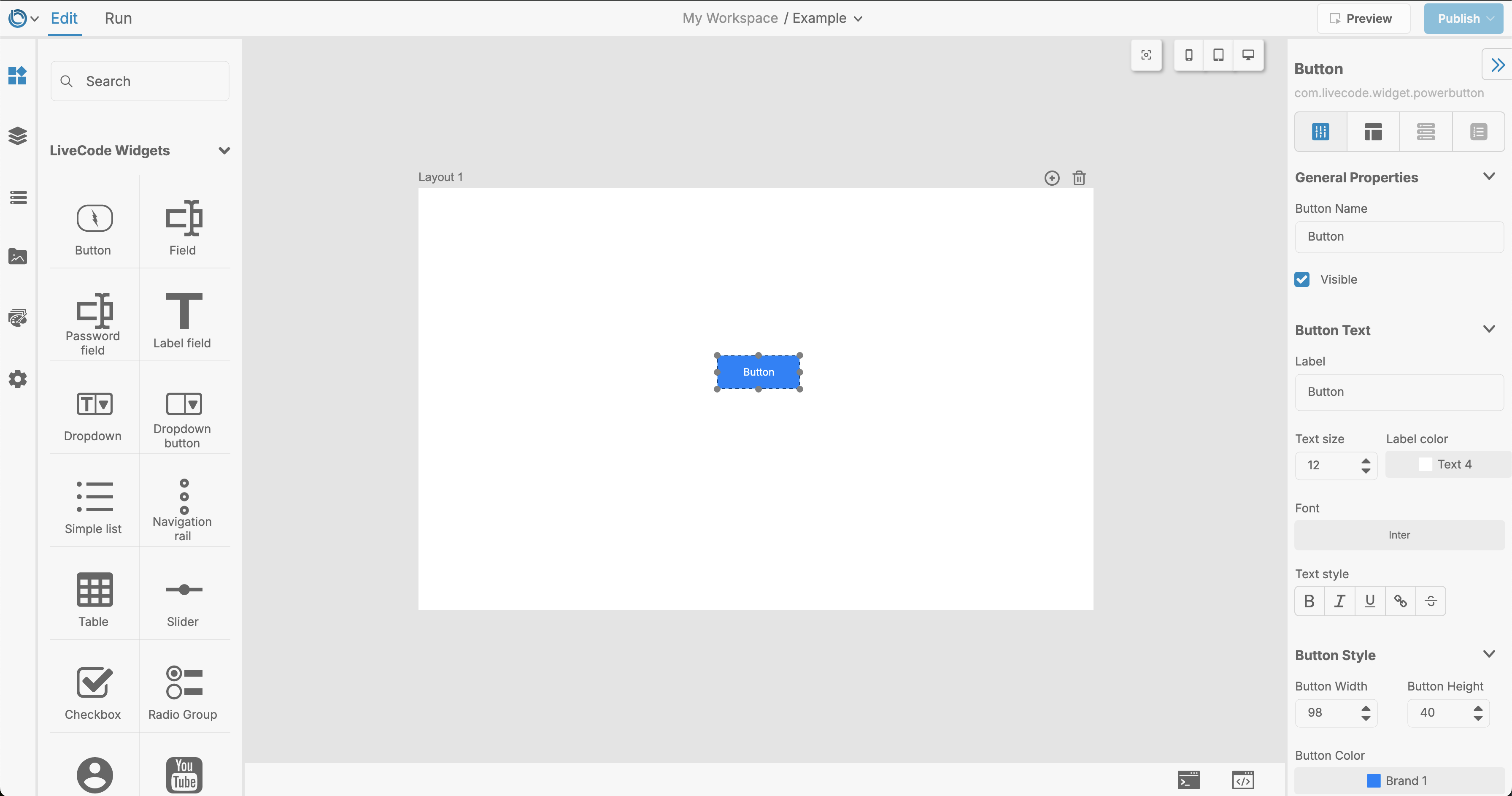
Customizing the Button
Styling the Button
- Background Color: Change the button's background color using the Button Color property to match your theme.
- Border Settings: Adjust the Border Width, Border Color, or make the button borderless.
- Hover Effects: Set a Hover Color or Hover Icon Color for dynamic visual feedback.
- Ripple Effect: Enable or disable a ripple effect when the button is clicked.
Text and Icon Customization
- Label: Set the button's text to communicate its purpose. Use the Label property in the Property Inspector.
- Text Alignment: Align the text (
Left,Center,Right) or even wrap it using the Wrap Text property. - Icon Position: Position the icon relative to the text (
Left,Right,Top,Bottom). - Corner Radius: Adjust the button's corners with the Rounded Radius property for a modern, rounded look.
Behavior Settings
- Clickable State: Enable or disable the button based on app logic.
- Ripple Effect Origin: Use the Center Ripple Effect to make the ripple start from the center of the button.
- Toggle State: Set the button as a toggle to keep it highlighted after being clicked.
Using the Button in Your App
Buttons in LiveCode Create can be used to trigger various actions. Common uses include:
- Navigating to a Different Layout: Add a navigation action to take the user to a new page.
- Submitting Data: Connect the button to a workflow for form submissions.
- Showing Dialogs: Use a button to display alerts or prompts.
To add actions:
- Select the button.
- Open the Actions Workflow panel.
- Drag and drop the desired action, such as "Navigate to Layout" or "Show Message Dialog."
Advanced Features
For more advanced use cases, the Button widget offers additional customization:
- Dynamic Labels: Use app data to dynamically set the button's label or icon.
- Hover Transparent Background: Set the background to transparent when hovered for sleek designs.
- Icon Rotation: Rotate the icon dynamically with the Icon Rotation property.
- Theming: Leverage theme variables to ensure consistent styles across your app.
Related Links
Conclusion
The Button widget in LiveCode Create empowers you to design buttons that look great and perform seamlessly. With its extensive customization options and ease of use, you can create buttons tailored to your app's needs. Start exploring the Button widget today to make your app more interactive and visually engaging!