Simple List
The Simple List widget in LiveCode Create is a flexible, templated list designed for common use cases. It supports customizable sections such as a leading icon or image, a title and subtitle, and a trailing section that can feature an icon, checkbox, delete button, or more. Built on the Material Design spec, it allows you to create clean, responsive lists effortlessly.
This guide will walk you through how to add, customize, and use the Simple List widget in your app.
Adding a Simple List to Your Layout
- Open your project in LiveCode Create.
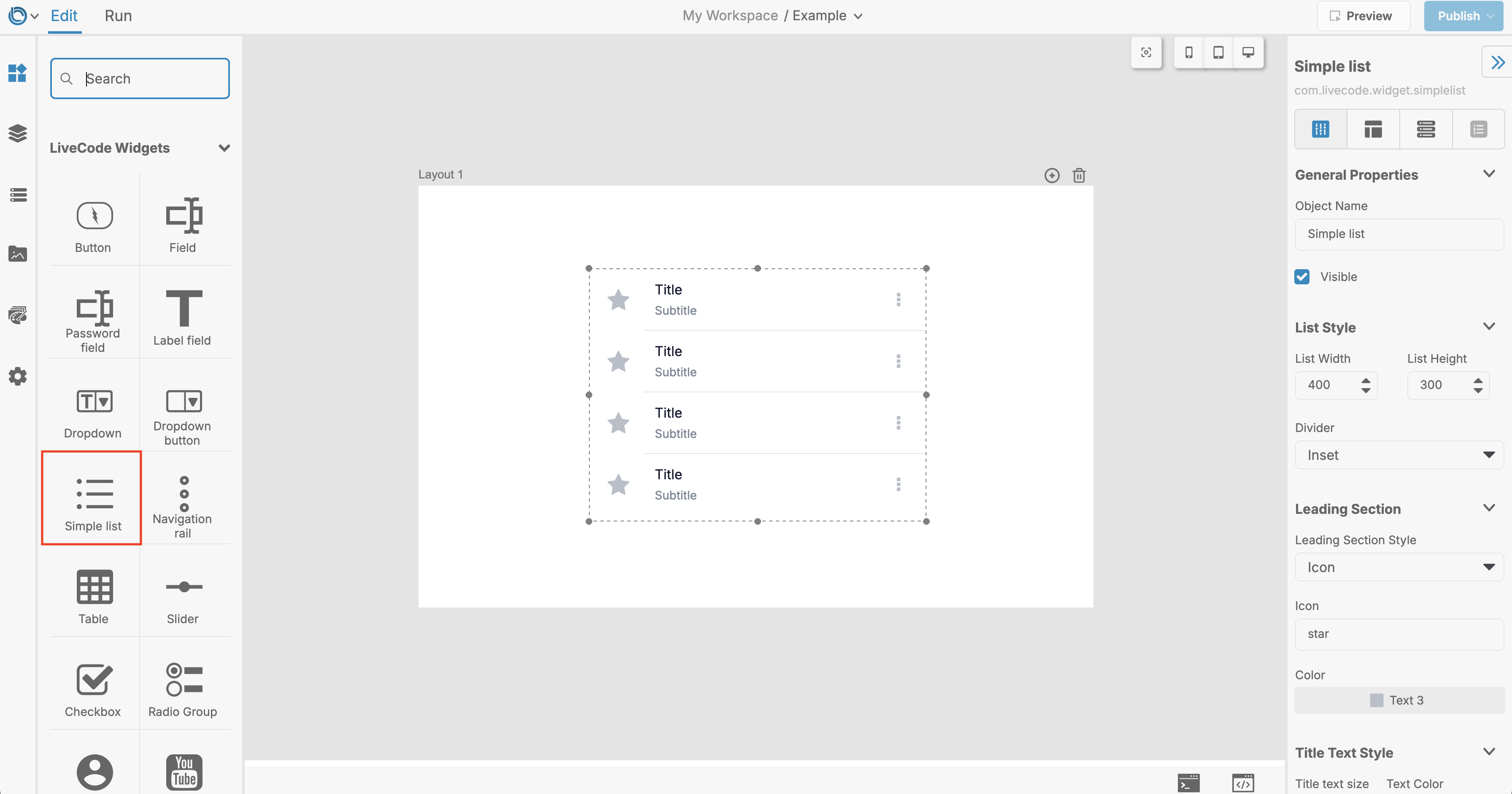
- Drag the Simple List widget from the Tools Palette onto the Canvas Area.
Customizing the Simple List
Defining the List Content
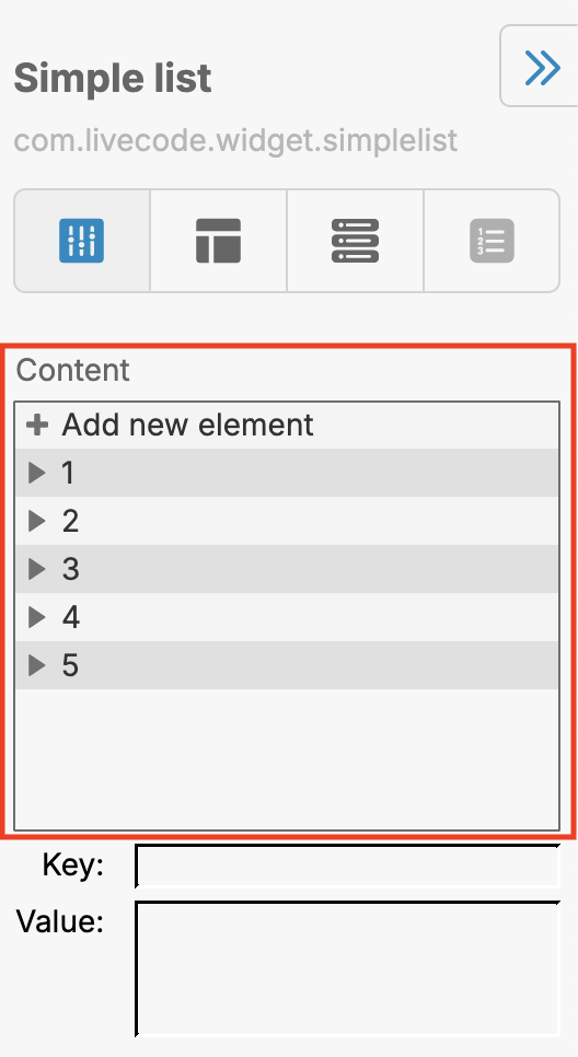
You can populate the list with a set of items by using the Content property:
- Content Format: Each item is defined as a line-delimited string with elements separated by tabs.
- Use the Property Inspector to quickly add items to the list or update existing ones.
Configuring List Sections
The Simple List widget consists of multiple sections:
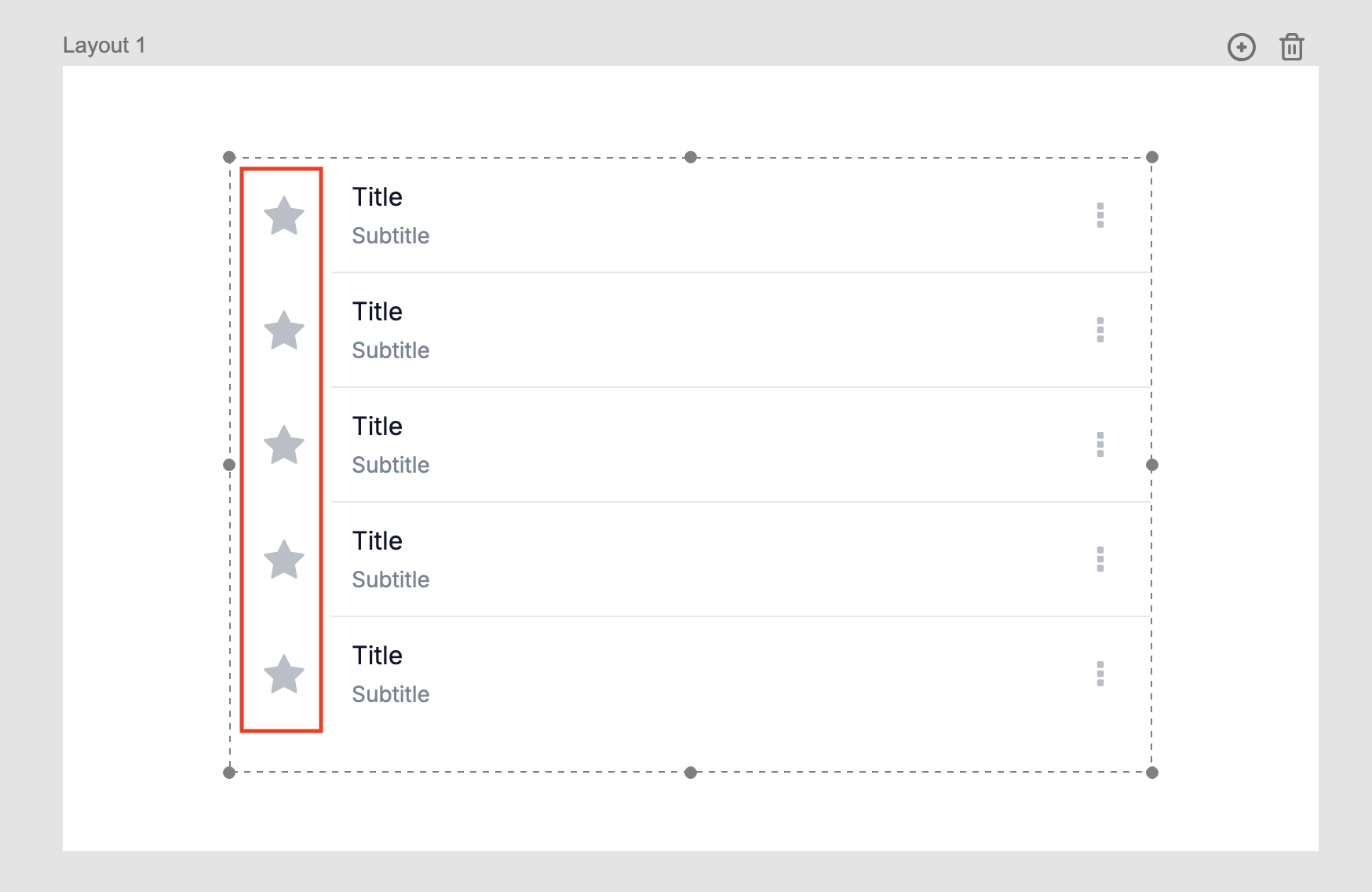
Left Section
- Options: You can display an icon or image in this section.
- Properties:
- Left Section: Choose the content type (
NoneorIcon). - Left Section Color: Set the background color.
- Left Section Size: Adjust the size of the left section.
- Left Section Hover Color: Customize the hover color.
- Left Section Highlight Color: Define the color when highlighted.
- Left Section: Choose the content type (
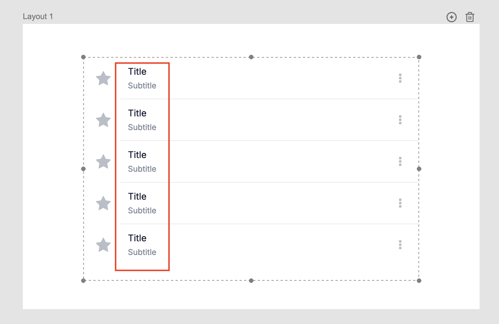
Title and Subtitle
- Properties:
- Title: The main text of the list item.
- Subtitle: Optional secondary text.
- Title Color: Set the color for the title.
- Subtitle Color: Set the color for the subtitle.
- Text Sizes: Adjust the font size using Title Text Size and Subtitle Text Size.
- Hover and Highlight Colors: Define hover and highlight colors for both the title and subtitle.
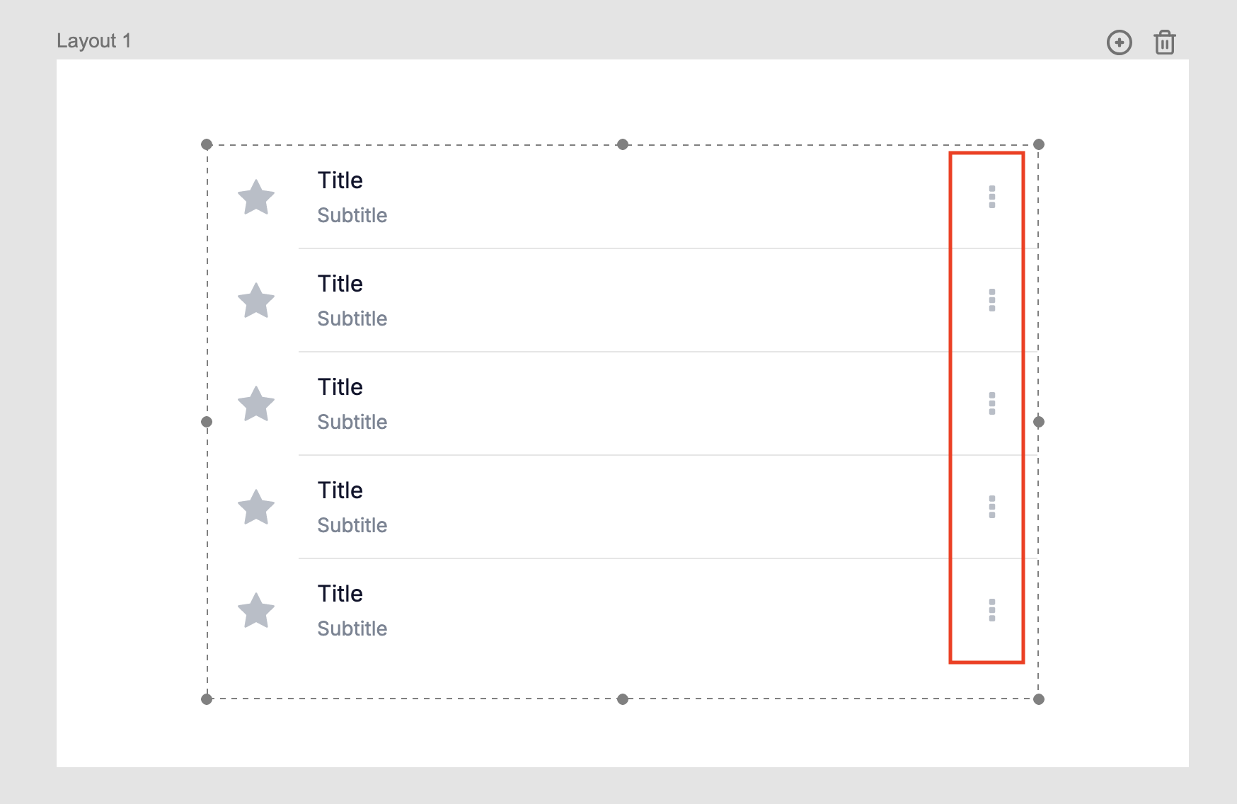
Right Section
- Options: Display an icon, button, checkbox, or delete button in this section.
- Properties:
- Right Section: Choose the content type (
NoneorIcon). - Right Section Color: Set the background color.
- Right Section Size: Adjust the size of the right section.
- Right Section Hover and Highlight Colors: Customize the hover and highlight states.
- Right Section: Choose the content type (
Styling the Simple List
Background and Dividers
- Background Color: Change the overall background color of the list.
- Divider: Choose a divider style between items:
None: No divider.Inset: Starts from the left of the text.Full: Spans the entire width of the widget.
- Divider Color: Customize the divider's color.
Hover and Highlight Effects
- Use the Hover Color property to set a background color when hovering over an item.
- Use the Highlight Color property to define the background color when an item is selected or active.
Advanced Features
Dynamic Sizing
The Simple List automatically adjusts its height based on its content. You can retrieve the required height using the Formatted Height property.
Using the Simple List in Your App
The Simple List widget is great for displaying interactive lists. Common use cases include:
- Navigation: Use the list to navigate to different layouts based on user selection.
- Data Display: Show data from a collection or database.
- Interactive Features: Add checkboxes, delete buttons, or actions to list items.
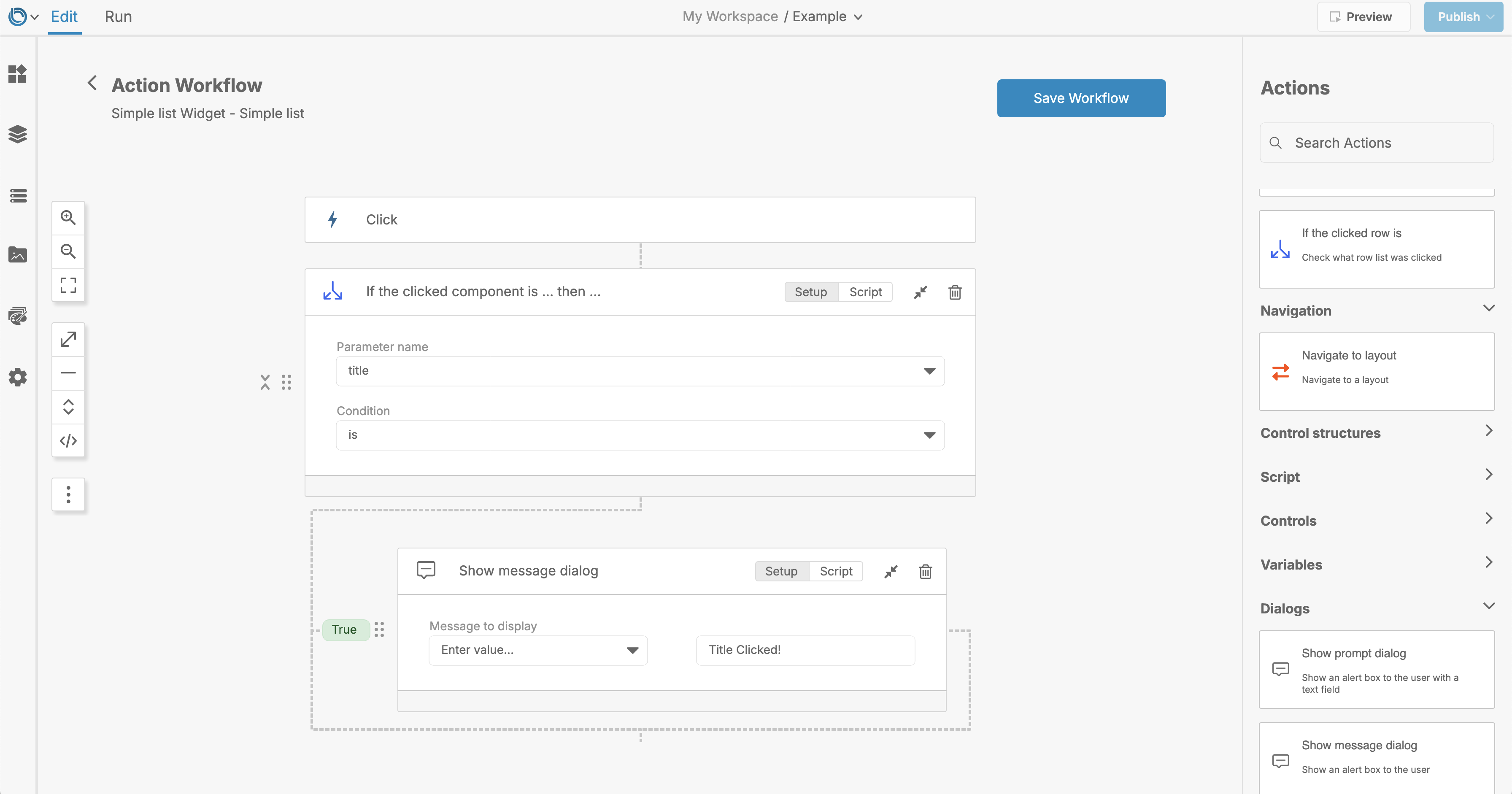
To add interactivity:
- Select the Simple List widget.
- Open the Actions Workflow panel by rightclicking on the widget and selecting Edit Actions.
- Define the actions for user interactions, such as clicking on a list item.
Related Links
Conclusion
The Simple List widget is a powerful tool for creating templated lists in LiveCode Create. With its customizable sections, styling options, and support for advanced features like filtering, it's ideal for a variety of app use cases. Add a Simple List to your app today and start building elegant, functional lists effortlessly!